3.5 Design Tips
Easy on the Eyes:
- Designers leave white space all around their content. This goes along with the "less is more" idea. You don't need to fill up every gap!
- White space emphasizes the content that is there and makes us focus on what is important. Too much and we begin to wander, like a blind duck in a forest. Use the white space to lead us to water ("The important stuff is here!").
- Color should be used sparingly. Use it for accent and to help guide the viewer.

Go with the Flow:
- Webpages will be designed by the webteam to allow the content to move "fluidly" as the window narrows. This is especially important when a webpage is viewed on smaller devices like iPads or phones.
- Percentages are always better for tables and columns when using true tabular data. Fixed widths will be avoided in any web content.
- Use tables for data (where information has definite column headings and rows).
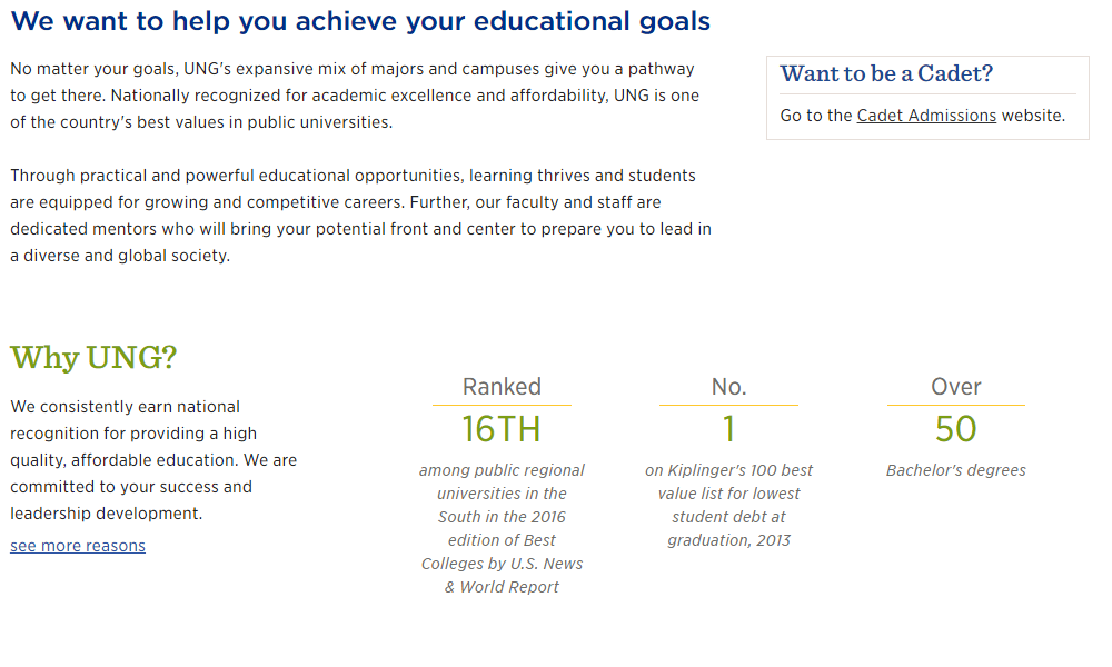
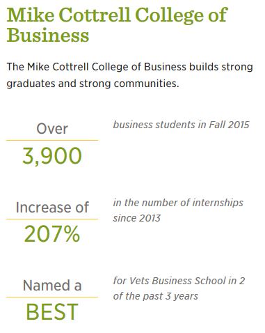
Below is an example of how a layout changes depending on the device being used.
Desktop View:
Mobile View:
Calls to Action:
- Don't leave it up to the viewer to know where to start and where to go next. Make it obvious.
- Are there steps? Show the steps.
- Is there more than one path? Show the choices clearly.

Less is More:
- "But they need to know it all!" you say. Perhaps, but did you write it as concisely as possible? Write, re-write, edit and re-write again, each time rearranging and taking out words, using different words, etc.
- Brainstorm with others as they may have an idea of how to word something in a way you haven't thought of before.
- Really... less is more.
Look at this example:
- We want this:
"Want to graduate this semester? Fill out the application." - Not this:
"Anyone desiring to graduate this semester is asked to fill out the application you can find here."
Unless you are very experienced at copywriting or ad writing, you're not going to be able to write this concisely the first time you try. Practice makes perfect. This is a skill, and a very valuable one for you to learn.
Try out some exercises in eliminating wordiness in Purdue University's Online Writing Lab.
Another Example - Content we received...
UNG Dahlonega Welcome Event
(Transition Student Welcome)
What: A self-paced “Welcome Event” designed to help you become more comfortable with the Dahlonega campus.
Who: All students transitioning to the Dahlonega campus, and their guests, are invited to attend this free event.
When: Wednesday, August 17th, 2016
Time: 9:00 AM to Noon
Where: Hoag Student Center (Check-in and pick up a list of available activities. Participation in activities is optional.)
Details: Join us for the UNG Dahlonega Welcome Event to learn more about the Dahlonega campus and its resources. Students will have the opportunity to tour campus and find the buildings where their classes will be located. Students can also meet with our professional advisors for advising support and visit the Campus Connection Bookstore to pick up books and gear. The Campus Shuttle will be available to show you the commuter parking lots and shuttle routes. Additional activities will also be available.
We are excited you will be joining us on the Dahlonega campus! Please register for this event and come learn more about the Dahlonega campus.
Registration Link: We request you register in advance for this event.Webpage that we made...


