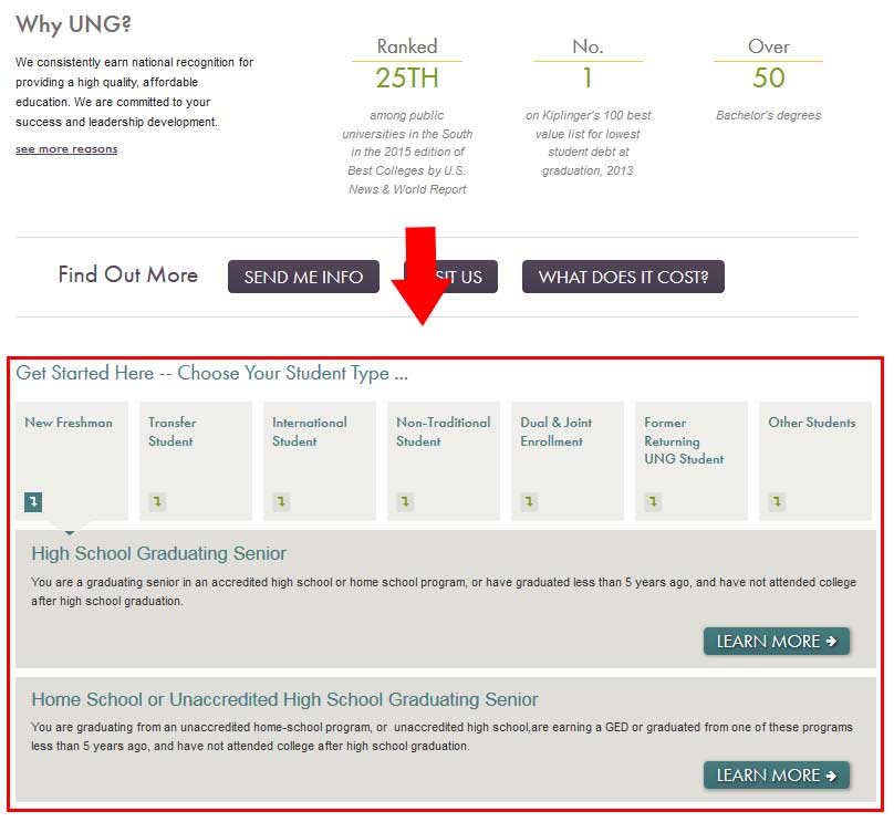
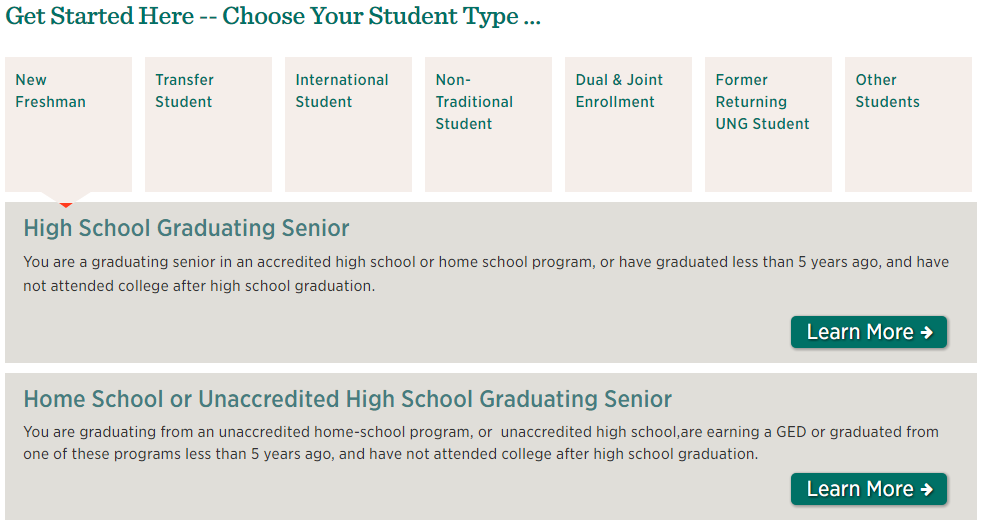
6.19 Tabs - Large
If you are interested in this type of tabs, please contact the webteam via ServiceNow (login required).
Best usages
- Displaying information in a step-by-step format [maximum of seven steps].
- Displaying categories of information where each category has a different call to action.
Styles & Usage
The style options that are available for this block are listed below:
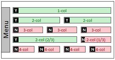
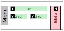
The diagrams below will help you determine where this block can be used. The "Y" inside the box, 

Administrator Only Block
Naming Convention
- Name of block should always begin with tabs-lg- or tabs-step-
Please be sure to double check your naming structure to ensure there are no spaces in between any words or dashes. Any space in the name will disrupt the functionality of your block.
Correct: tabs-lg-fall-signup
Incorrect: tabs lg-fall -signup
Character Limits
- Tab text - 40 characters
- Button text - 15 characters
What can I add to this block?
- Links? Yes
- Other Blocks? Yes
- Columns? Yes
- Sections? Yes


