6.20 Tabs or Expandable
The 'Tabs or Expandable' block provides an easy method to create either tabs or expandable areas. Both of these display options allow for condensing large amounts of content into manageable chunks of information for a page visitor.
Best Usages
- Tabs work great for condensing information that would normally be on different pages into one page. For example, information on an upcoming conference could be displayed on one page using tabs: About the Conference / Program / Venue / Register.
- Expandables work great for content such as frequently asked questions, information separated by campus, or steps a user should follow.
- For the presentation of lengthy or complex information, sections and columns can be added to both tabs and expandables.
Example
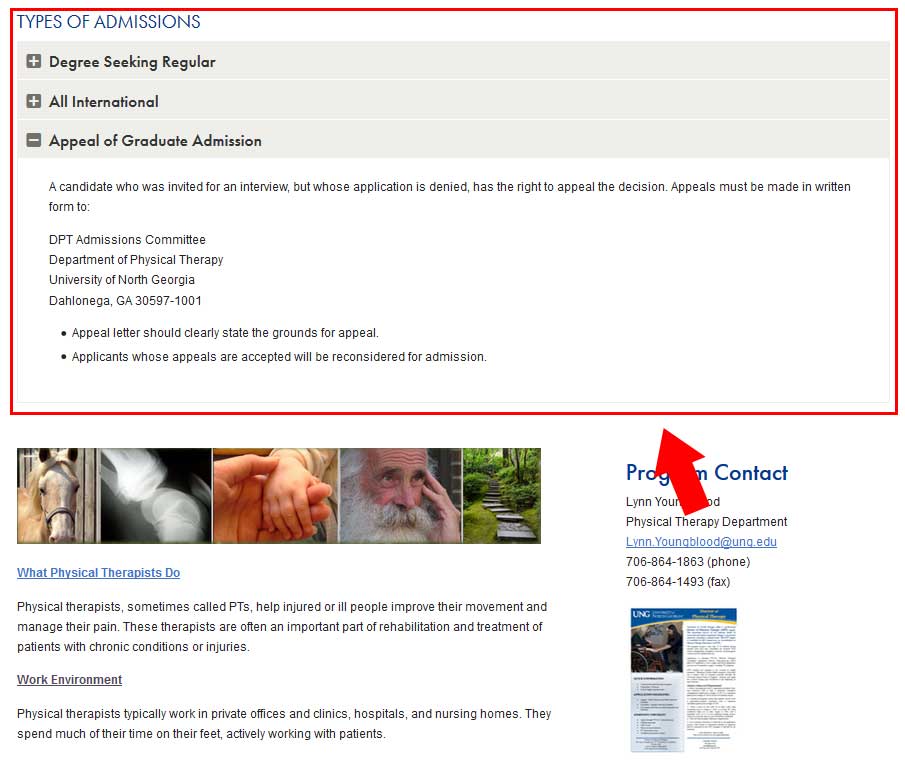
Styles & Usage
The style types that are available for this block are listed below:
Tabs
Type 1: Light Option

Type 2: Dark Option

Type 3: Blue-Gold Option

Type 4: White
Expandables
Type 4: Gray Heading
Type 5: White Heading
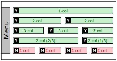
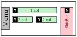
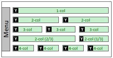
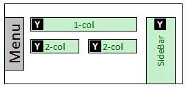
The diagrams below will help you determine where this block can be used. The "Y" inside the box, 

Tabs
Expandables
Tabs
Naming Convention
- Name of block should always begin with tabs-sm-
Please be sure to double check your naming structure to ensure there are no spaces in between any words or dashes. Any space in the name will disrupt the functionality of your block.
Correct: tabs-sm-fall-signup
Incorrect: tabs-sm -fall-signup
Character Limits
- N/A
What can I add to this block?
- Links? Yes
- Other Blocks? Yes
Expandables
Naming Convention
- Name of block should always begin with exp- and should never end with a number
Character Limits
- Tab Text/Headings - 15 characters
- Content - unlimited
What can I add to this block?
- Links? Yes
- Other Blocks? Yes, but use with caution.
- Images or Slideshow
- Links - Featured or Related
- Basic Text - plain or boxed
- Columns? Yes
- Sections? Yes

