5.6 Slideshows & Random Image from Set

Everybody loves a slideshow, right? 

Not so much.  Many studies have shown that people just don't sit through a slideshow. Rare is the slideshow with photography compelling enough to slow a visitor down from their task and look at the pictures.

Try this instead: Load an image randomly selected from your predefined set each time your page publishes (minimum of daily.)

If you still feel you need a slideshow, please consider the following: 

Use Compelling Imagery - A picture speaks a thousand words, making them one of the most effective mediums to quickly tell a story to your audience. Vivid and relevant images can instantly capture the attention of those visiting your site, giving you a better chance of keeping them interested and exploring. Likewise, poor quality photographs can send a negative impression of your site. Contact the webteam via ServiceNow (login required) for guidance.

Use images of people or places from all campuses, unless you are dealing with a campus specific page.

Focused Calls to Action - More often than not, your slideshow will be the first thing a user sees when they visit your website. It’s imperative that you include your most important calls-to-action in your slideshow.  Messaging should be bold; “Apply Now” or “Bachelor Programs” are conducive to inspire user action.

Key content or messaging should not be communicated solely within an image. If content is included within the image, this information should be repeated in the alt text for the image, to comply with accessibility guidelines.


The truth about slideshows...

They are a cool element of a webpage, however a case study shows they aren’t effective. Of all visitors only 1% clicked a feature. Of those, 89% were the first position.

Not good - only 1% of clicks for the most important object on the home page?
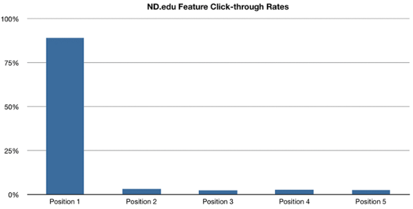
visual showing image positions and percentage of clicks - Position 1: 89.1% | Position 2: 3.1% | Position 3: 2.4% | Position 4: 2.8% | Position 5: 2.6%